about
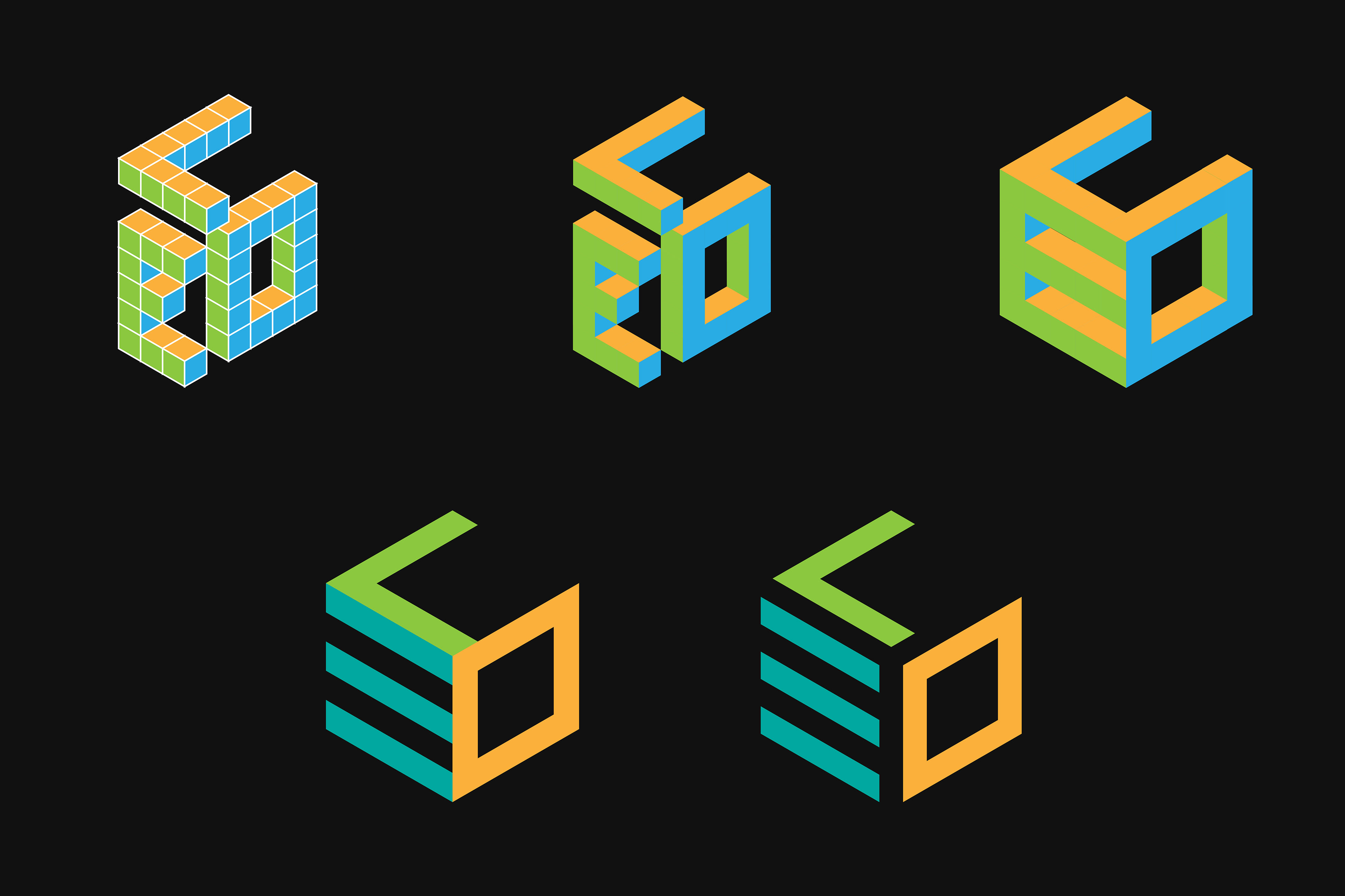
creating a personal logo mark is a challenging task. here is the process of how this isometric logo was developed
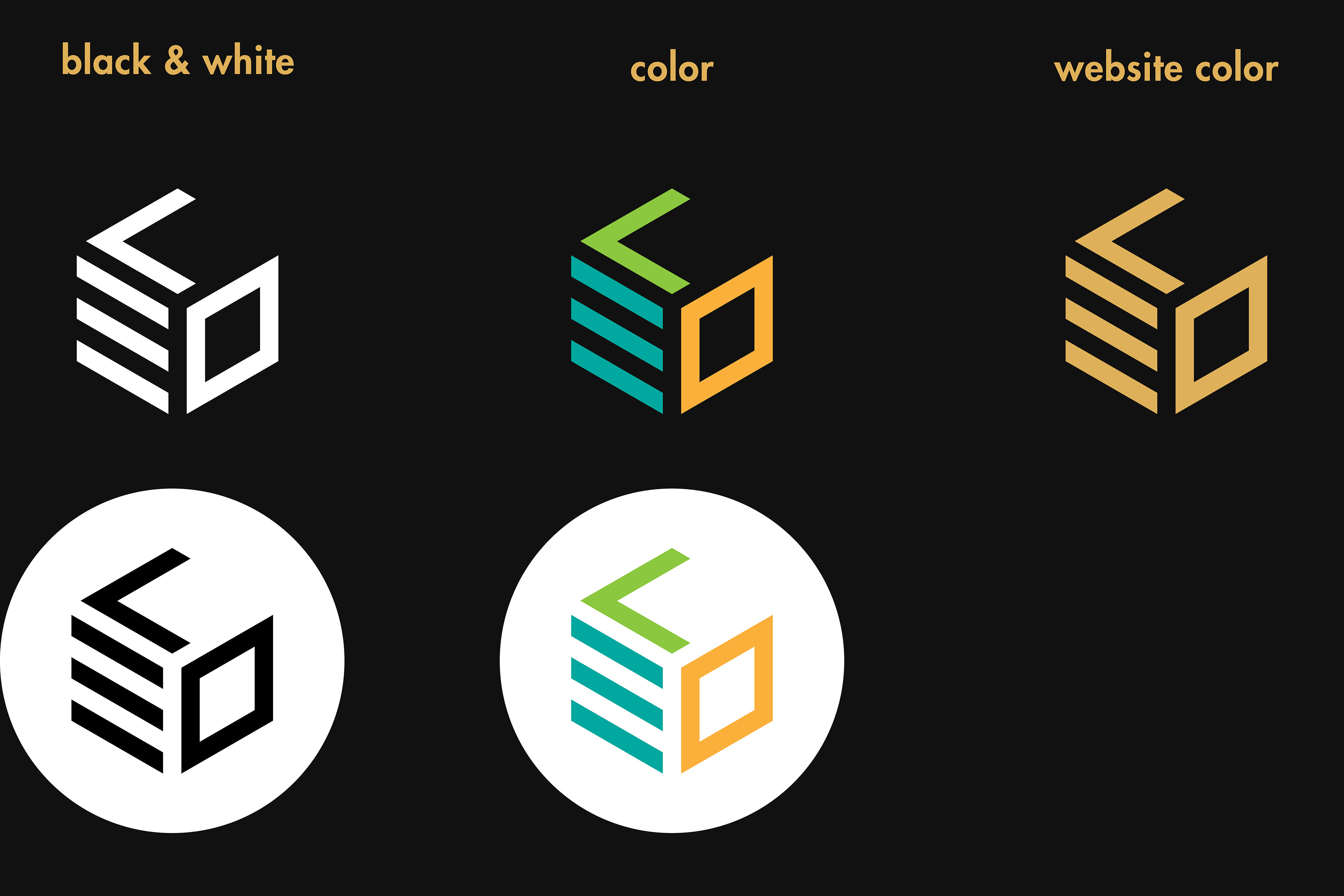
in the case of my logo, the challenge was to incorporate the letters "leo" into a unique and compelling isometric design. after many variations i’ve designed over the years, this version has been the most successful in its simplicity and functionality in design.

design
my personal logo uses the letters in "leo" to create an isometric design that embodies my identity and brand.
the logo is bold and modern, with clean lines and sharp angles that suggest strength and confidence. the "L" and "O" letters are tilted at different angles to create a sense of depth and dimensionality, while the "E" letter is cleverly simplified to just three lines, adding a level of subtlety to the design.